Webviews Branding
This guide will help you understand the branding options available to customize the appearance of your Jedlix Connect Webviews. By utilizing these options, you can create a consistent and unique look and feel that aligns with your brand identity.
How to enable branding
To enable branding, please share the required details with your assigned Customer Success Manager. Our dedicated developer team at Jedlix will then implement the branding options you have chosen.
Branding options available
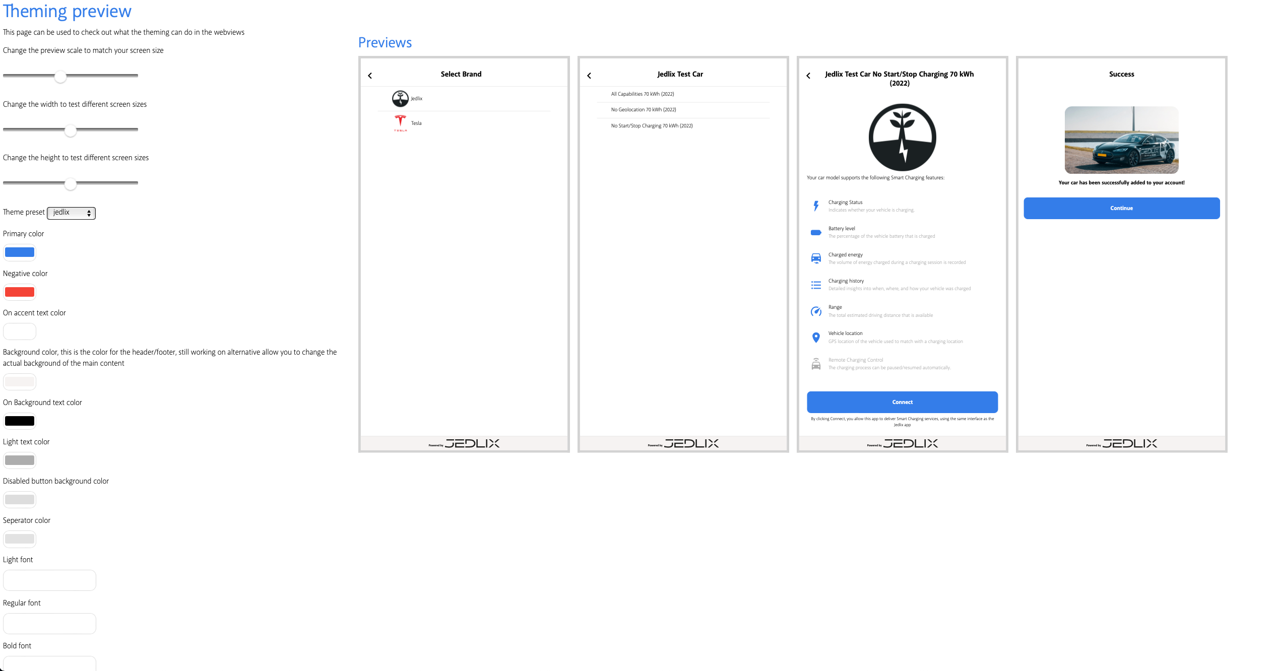
Here is a list of branding options grouped by category:
Colors:
- Primary color: Main color for buttons, links, and interactive elements.
- Negative color: Color for negative or destructive actions.
- On accent text color: Text color displayed on primary or accent-colored elements.
- Background color: Color for header and footer background.
- On Background text color: Text color displayed on the background color.
- Light text color: Color for less important or secondary text elements.
- Disabled button background color: Color for disabled buttons.
- Separator color: Color for separators and dividers between sections or elements.
Fonts:
- Light font: Font for light-weight text elements.
- Regular font: Font for regular-weight text elements.
- Bold font: Font for bold-weight text elements.
Please note that you need to provide the color codes (e.g., HEX, RGB, or RGBA) and font names or files for the branding options you choose.
Implementing the branding options
Once you have shared the required details with your Customer Success Manager, our developer team at Jedlix will implement the chosen branding options into your Jedlix Connect Webviews. This will ensure a seamless experience for your end-users that reflects your unique brand identity.